Luster Studio
Luster Studio, a distinguished jewelry studio in Philadelphia, approached us with a unique challenge - to redesign their brand identity to reflect their whimsical, cute, and ethereal aesthetic. The studio's focus on creating exquisite designs inspired by the iridescent beauty of pearls provided us with a strong foundation to craft a new visual identity that resonated with their core essence while appealing to their target audience.
Client
@luster.studio.phl
Overview
Objective
Our primary objective was to create a captivating brand identity for Luster Studio that would seamlessly translate their jewelry designs into a visual language. We aimed to evoke a sense of enchantment and delicacy through a logo and color palette that resonated with the studio's signature style.
Our journey began by immersing ourselves in the world of Luster Studio's jewelry designs. We meticulously studied their collection, paying special attention to the intricate details, iridescent shades of pearls, and the emotions each piece invoked. This research phase allowed us to extract essential design elements that could be seamlessly integrated into the brand identity
Research and Conceptualization

Mood Board
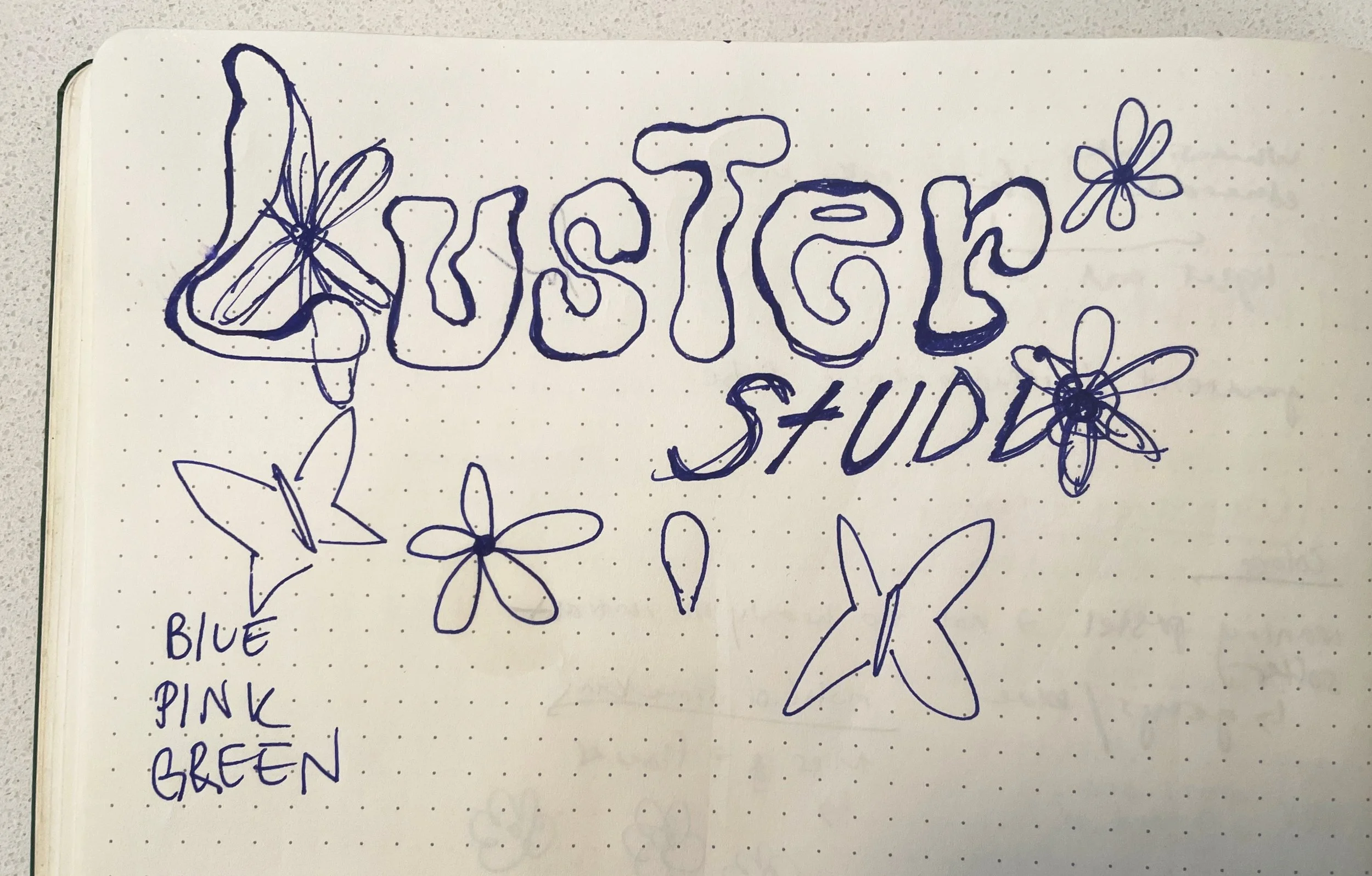
Logo:
Drawing inspiration from the organic shapes and delicate lines present in Luster Studio's jewelry, we crafted a whimsical and elegant logo. The logo featured a graceful, handwritten font that added a personal touch, while a stylized pearl icon served as the focal point. The pearl's iridescent colors were subtly replicated, infusing the logo with a touch of magic
.
Design Elements:
Color Palette:
The iridescence of pearls served as the foundation for the color palette. We curated a selection of soft pastels and ethereal shades, reminiscent of the play of light on pearls. The palette included gentle pinks, opalescent blues, pale lavenders, and hints of shimmering gold. These colors were carefully chosen to create an enchanting and dreamy atmosphere that aligned with Luster Studio's artistic vision.
.

With a clear design direction in mind, we began the execution phase. Iterating through multiple logo concepts, we refined the chosen design to strike the perfect balance between whimsy and sophistication. The color palette was meticulously applied across various touchpoints, from business cards to packaging, ensuring a consistent and immersive brand experience.
Execution
The redesigned brand identity for Luster Studio successfully captured the essence of their jewelry designs. The new logo and color palette seamlessly translated the studio's creative energy and whimsical charm into a visual language that resonated with their target audience. The enchanting color palette set the tone for their brand, creating a cohesive and unforgettable identity.
Results

Impact
The refreshed brand identity received overwhelmingly positive feedback from both existing and new clients. It breathed new life into Luster Studio's image, helping them stand out in a competitive market. The logo and color palette effortlessly conveyed the ethereal quality of their jewelry and created a sense of recognition that extended beyond their physical products.